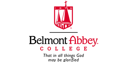
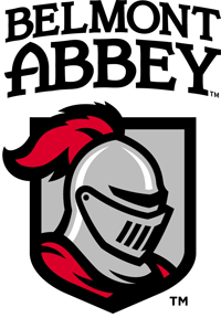
 BELMONT — Belmont Abbey College recently unveiled new academic and athletic logos that reflect the Benedictine college's history and unify its branding.
The redesigned marks are the result of more than a year of discussions involving dozens of Belmont Abbey College students, faculty, staff and alumni, as well as the monks of Belmont Abbey, under the direction of the college's executive team, to answer the question: "Who are we and what image do we want to project?"
"The new marks are part of an effort to build a national brand for Belmont Abbey College," said Rolando Rivas, Belmont Abbey College's director of marketing and communications, in a release. "We want to inspire a new generation of young men and women to choose the Abbey. With these fresh, cohesive marks, we feel we're clearly communicating our history, principles and our beliefs. The consistency between the primary marks will also help us more efficiently build awareness for the college."
The new academic logo intends to convey both the Benedictine roots of the private Catholic college west of Charlotte, as well as its tradition and history, with its founding year of 1876 clearly represented. The logo also highlights the most recognizable architecture on the college's campus: Mary Help of Christians Basilica. Additionally, the new mark with its shield and custom typeface evokes the excellence and virtue the college hopes to instill in its students, echoing its mission to educate students in the liberal arts and sciences so "that in all things God may be glorified."
"While the marks definitely represent something new for the Abbey, we wanted to be clear that our tradition continues to this day," Rivas said. "This is just a fresh take on something that's been around for a long time."
The new athletic mark is a redesigned Crusader with both a regal and competitive look. It has a more engaging style than the old logo, which was in profile. While having a historical origin, the new rendition also adds a level of modernity to the mascot design.
"By successfully reinvigorating and standardizing our marks – logo, font, and colors – we believe that we have achieved both our goals of enhancing our brand identity and creating a consistent look that is more readily identifiable," said the college's athletic director, Stephen Miss.
Along with initiating the new marks, last year the college began a trademarks and licensing program and hired Learfield Licensing to manage its licensees. Learfield assisted Belmont Abbey in identifying a design partner, Rickabaugh Graphics of Gahanna, Ohio, that developed both logos. The firm was among four that responded to Belmont Abbey's request for proposals through Learfield.
Rickabaugh has extensive experience in the collegiate market. It also has created award-winning logo designs for numerous Fortune 500 companies and celebrities, as well as pro sports brands for the NFL, NHL and NBA.
The college will begin using the new logos immediately, and has plans for larger promotions when the fall semester begins. Over the next several months, the college will update its electronic media, roll out new stationery and update logos across the campus. The college will also update its athletic uniforms and stock new apparel and other merchandise in its bookstore.
"We're excited about it," Rivas said.
— Catholic News Herald


